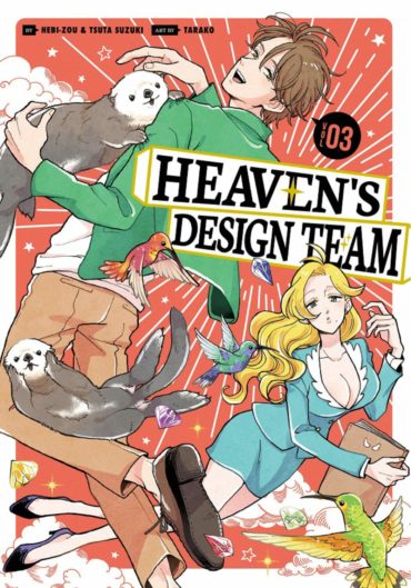
Heaven’s Design Team Volume 3 Review
In Heaven’s Design Team, we’ve already met two of God’s angels, Ueda and eager rookie Shimoda but we haven’t encountered any of the beings inhabiting the Other Place. Until now! So when Yokota ‘recently transferred from Heaven to Hell’ (Ueda used to be his boss) approaches the design team, asking for help, they feel duty bound to assist. Yokota’s team is in the middle of designing a theme park called The Land of Darkness and Fire. He asks them to come up with a mascot to greet visitors as they arrive and he’s even sketched a three-headed creature to show what he has in mind. (Very different from the vague and often confusing requests of their heavenly employer!) When the designers learn that Yokota can adjust the environment to suit the animal’s requirements, they’re all suddenly really keen to pitch ideas, so Mr Saturn divides them into two competing teams. Which team’s design wins?
The divine request for ‘A bird that looks like a precious stone’ attracts the attention of Venus (birds are their speciality) but they’re thrown off-course when another request arrives for ‘A bird that produces precious stones’. Consultations ensue with engineer Mars, followed by the Insect Department, resulting in the creation of the humming-bird – and one other, rather unexpected avian emerges as a collaboration (in the end) between Mercury and Venus. A flightless bird.
A break for lunch finds Jupiter tucking into an enormous plateau de fruits de mer, featuring a cross between a crab and a shrimp which turns out to be delicious! And so the spiny lobster earns God’s seal of approval. Watching in amazement is Neptune with a new furry companion, designed to be ‘an animal that’s bad at swimming’. As – to Neptune’s horror – Jupiter feeds the little creature seafood, Neptune realizes that his new pet’s enthusiasm for seafood will mean some major design changes are called for. The result? The sea otter. Gentle-hearted Neptune is almost overcome by the cuteness of his new design (as is Shimoda too) “Aww! Who’s my clever widdle cutie?” and the two continue to marvel at the adaptability of the sea otters as they display new skills to survive in their new environment.
Of course, there are still plenty of challenging design concepts to realize issuing from Heaven, although Mr. Saturn’s grandson Kenta presents a perplexing problem when doting grandpa determines to bring another of young Kenta’s drawings to life to cheer the little boy up. The resulting prototype sends chills up Shimoda’s angelic spine as the designers try to make the alien creature (emphasis on ‘alien’ although not That One, this time) work. However, an unexpected solution (and an unexpected collaboration with Pluto) bring matters to a successful conclusion.
If you’ve watched the engaging TV anime series of Heaven’s Design Team, (Winter 2021) you’ll already be familiar with most of these stories, even though not all of them appear in the same order in the series. However, the bonus in reading them in their original manga format is you get little extras that didn’t make it into the anime and also Hebi-Zou’s factual and fascinating entries in The Encyclopedia of Real Animals that follow each chapter. How could you resist a Special Feature entitled ‘Herbivores’ and Carnivores’ Field of Vision’ or ‘Bird Necks’? The appearance of Yokota might have injected some Heaven versus Hell drama into the story but I like the fact that writers Tsuta Suzuki (and Hebi-Zou) have chosen a rather different route. The design team actually enjoy working for Yokota because his design briefs are so specific (unlike the Almighty) – and when they’re invited to Hell for a party in the last chapter in this volume, they get all dressed up and bring Yokota gifts. Skeletal gifts! He is, of course, absolutely delighted, especially when he’s encouraged to guess what the creatures are. “It’s a one-eyed giant!” turns out to be the most surprising one of all.
Praise yet again to translator/letterer JM Iitomi Crandall for their fluent translation, both of the lively conversations between the designers and all the factual material in the encyclopedia. The cover illustration (like the others in the print versions) uses a fluorescent orange (to match the bright neon green and yellow of the earlier volumes) and the catalogue cover illustration featured here doesn’t really do it justice! This print edition originally appeared in Kodansha’s digital-first range, so you can read ahead digitally, if you don’t want to wait for the next print volume (six volumes, ongoing) to find out what the designers get up to next!


